News
 Yugipedia 3.3.0 - Genesys Update
Last updated October 24, 2025 at 02:48 PM CDT
The Wait is Over!
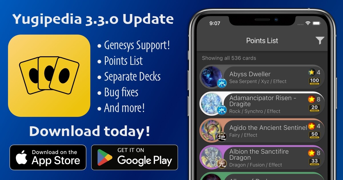
Yugipedia now has full support for the new Genesys format!
Konami announced Genesys in September 2025 as an alternative to traditional Yugioh. It uses a point system instead of a Forbidden and Limited List, and focuses on classic gameplay without Link Monsters or Pendulum Monsters.
What Changed
Adding Genesys support required rebuilding how the app handles game formats. Previously, the app only supported one format. Now it can track multiple formats, keeping decks separate and allowing you to switch between Regular and Genesys modes.
Each format also has its own card pool. When you're in Genesys mode, the app won't even load Link Monsters or Pendulum Monsters into the card pool, keeping the card selection focused on what's actually playable in that format.
What You'll See
After updating, the app works the same unless you switch to Genesys format in Settings. Here's what changes when you switch:
- The Banlist tab becomes the Points List tab. It shows every card with a point value, sorted alphabetically like the official list. You can customize the sort using the built-in Sort/Filter menu.
- The deck editor tracks your point total. At the top of the screen, you'll see how many points your deck is using out of the standard 100-point cap. Every time you add or remove a card with a point value, the total updates in real time. You can see it on the deck list too, so you always know where you stand. If you exceed 100 points, the count will turn red to let you know (this 100-point cap will probably be configurable in Settings in a future update).
- The deck tester uses the classic field layout. No Extra Monster Zones or Pendulum Zones. Just five monster zones, five spell/trap zones, and one field spell zone.
- Deck exports include point totals. When you share a Genesys deck, the exported text shows the deck name followed by the point total in parentheses, like "Blue-Eyes Genesys (87/100 pts)." That way anyone you share with knows the deck is legal before they even import it.
- You can import decks from other formats. If someone sends you a Regular format deck and you're in Genesys mode, the app will offer to switch formats for you and open the deck immediately. No more confusion about where your imported deck went.
How to Switch Formats
Go to Settings, find the Game Format option, and tap it. You'll see two choices: Regular and Genesys. Pick the one you want. The app will restart and load your decks for that format.
If you have decks in both formats, you can switch back and forth as much as you want. Your decks stay right where you left them.
What's Next
I'll be watching for bugs and making improvements as players start using this feature. If you run into issues or have suggestions, let me know.
The app's card database will get regular updates as Konami announces new point values. Rest assured I'm watching for the new Points List to drop on October 27th.
The version 3.3.0 update is live on the App Store and Google Play!
 Yugipedia 3.1.0 - Routine Update copy
Last updated October 24, 2025 at 02:29 PM CDT
Release Notes
Not a lot of new features, but lots of improvements and compatibility updates to keep Yugipedia running smoothly on modern devices:
- Interface is snappier and more responsive now
- Made searching even faster and improved search support for cards with non-English characters (Ü, ñ, ú, é, etc.). This both improves current search for cards with these characters and paves the way for expanded language support in a future update
- Optimized app memory usage. It shouldn't get killed by the OS as much in the background now
- Improved and streamlined privacy handling interface
- Updated code to support Android 15 and iOS 18. Bumped minimum iOS version to iOS 15 to fall in line with Apple standard
- Fixed: App no longer crashes on iOS 18.2+ when you attempt to purchase "Remove Ads". Apple made major changes to how their in-app purchases work and that caused this crash to start appearing in iOS 18.2 and onwards. Thanks everyone for your patience while we worked this out, and thanks for your support!
- Several bug fixes and improvements
This is not all that I wanted to include in this update, but the iOS purchasing bug forced me to release the update early. I'm currently in the process of adding language support to both the text in the app's interface and the card text itself. Hopefully the next major update will support some extra languages, with more to follow over time.
The update is live on the App Store and Google Play!
 Yugipedia 3.0.15 - User-friendliness Update
Last updated April 24, 2023 at 06:39 PM CDT
Release Notes
Lots of tweaks and improvements in this release. The goal was to improve overall user friendliness and user experience, and to fix the most annoying bugs. Here's what changed specifically:
Database
- Added the new Illusionist monster type
Card Details
- Added a visual indicator to show new users that you can swipe between cards
- Added a Tips popup
- Added Help page
- Increased card swipe speed
- Increased max font size for effect boxes in full card images
- Centered spell/trap type vertically with its icon
- Fixed: Spell attribute icon now says 'Spell' instead of 'Magic'
Deck Bar (the deck toolbar at the top of Card Details)
- Added tip to clarify functionality
- List now uses as much height as it needs to show your decks (instead of always being a fixed height)
- Added drop shadow to better separate toolbar from the rest of the screen
- Made it harder to accidentally tap the count buttons
- Added special case for when you only have 1 deck (instead of it showing an empty list)
- Fixed: Decks are now sorted alphabetically, case-insensitive (instead of case-sensitive like before)
- Fixed: Newly created decks sometimes didn't show up in the list if you hadn't added cards to them yet
Sort/filter screen
- Made this screen much taller so you can see more of the sort/filter buttons
- Filters no longer reset on each new search (based on much user feedback)
Search
- Added tip to clarify functionality
- Search suggestions and search history items are smaller now, so you can see more at once
- Centered 'No results found' text, and added more padding
- Show total # of cards even when no search has been made
- If your search query doesn't find any results, the app always tries to search for similar terms if feasible. But it didn't always clearly explain that the search terms changed because the original terms didn't find any results. This could feel like the app is randomly changing your search terms for no reason. Now it more clearly explains that results weren't found for your search, but it was able to find results for a similar query.
- Made Android back button behave more naturally when searching
- Card number search is back! Any 8-digit number will now look for matching card numbers like the old app did
- Fixed: On the keyboard, the Enter key is now a Search button when the search bar is focused (as opposed to saying something generic like 'Enter' or 'Done')
- Fixed: Screen no longer "jumps" on Android when focusing text field
- Fixed: Search was sometimes inaccurate when using Android predictive typing or swipe-to-type. That's because it would introduce a trailing space that could throw off search results (particularly when searching card text). Now any leading or trailing space is ignored in search queries.
Decks
- Added support for missing cards that aren't in your database yet (e.g. when you import a deck with cards from a newer database update that you don't have yet)
- Added more descriptive errors when recovering decks from old app
- Made short link generation dialog dismissible when sharing deck link (in case of network issues that make it take too long)
- Fixed: Add to Deck tutorial stopped showing up after one of the most recent updates. It's back now for new users.
- Fixed: Decks tab help button was also showing up on Test tab
- Fixed: Recover Decks button was showing up in Decks tab for old Yugipedia users that had no decks to recover
Miscellaneous
- Restored tab behavior from old app. Now if you tap the tab icon for the tab that you're already on, it will go all the way back to the first page of that tab.
The update is live on the App Store and Google Play! Give it a try and let me know what you think.
 Yugipedia 3.0 - Complete Overhaul
Last updated December 12, 2022 at 04:50 PM CST
What is this?
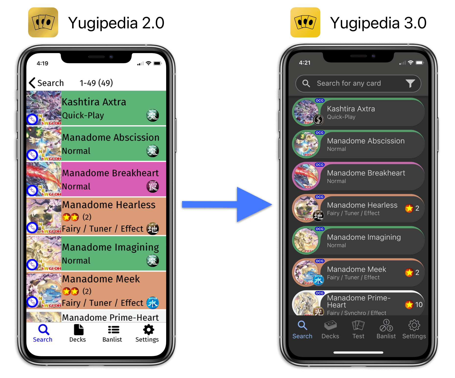
This is an update that I've been working on for a long time, and it's finally out of beta and available for both iOS and Android. This update completely overhauls the UI and makes improvements across the board to user experience, database updating, searching, deck building, and deck testing. Here's a quick breakdown of the massive changes this update brings to the table:
- Vastly improved UI throughout the app
- New dark theme is easier on the eyes
- Redesigned card lists have uniform font and less color, making it easier to read. And they fit more cards on the screen than the previous design.
- Swipe between cards on the redesigned Card Details screen
- Full card images are generated on the fly now using the card art, so now even new cards will have English text for the full card
- New "Display Zoom" setting allows you to grow or shrink the entire UI to your liking
- Improved search engine
- Suggestions - app suggests card names as you type
- Typo tolerance - will help you find what you're looking for, even if the spelling isn't 100% accurate
- Search history - keeps a list of previous searches
- Enhanced sorts and filters - new sort/filter system is easier to use and more flexible
- Lightning-fast deck building lets you add cards with a single tap and change the card amount with a second tap
- New "Add Cards" screen lets you add cards to the deck straight from search results
- Master Duel banlist
- Dedicated "Test" tab means you can use the deck editor without quitting your deck test
- New coin/dice animations for the deck tester
- Database updates are now much smaller and faster, saving time and bandwidth
- Overall faster and more efficient app
The update is live for everyone on the App Store and Google Play! Give it a try and let me know what you think.
I want to hear what you think about this new update. Please send feedback to feedback@logick.app.
What if I don't like the new update?
I know some of you have grown quite accustomed to the way the app looks, and you may not be a fan of the new changes. If that's the case, please let me know what you do/don't like about the new UI. I want to know in as much detail as possible what exactly it is you liked better about the old app.
The app design and features are not set in stone, not by any means. I plan to keep working on it and adding more to it. I'm open to changing things, or at least adding multiple options so everyone can have an experience that they like.
Here are some changes that I'm thinking about making so far based on feedback from the beta test:
- Adding more layouts for the card list. Here's what I'm thinking right now:
- Classic layout - this would be pretty much the same layout as original Yugipedia. Big square card images with full color backgrounds.
- Neo-classic layout - this would have the same overall design as the Classic layout, but I would give it a more modern look. Slightly rounded corners on the card image with better spacing and maybe more uniform font.
- Modern layout - the current layout of Yugipedia 3.0
- Grid layout - similar to Master Duel and Duelingbook. Instead of a list, you would have a grid of actual cards.
- Adding an optional Light Mode instead of forcing Dark Mode
- Adding the card type counts back to the Deck Editor. I'm thinking keep them hidden by default and have a button that can show them.
What if I DO like the new update?
Please let me know. It's critical for me to get feedback from both sides so I can accurately judge how the app is being received. I always make decisions that I think most people will love, but it's good to get feedback to let me know if I'm on the right track.
Future Plans
I have tons of things that I want to add to the app. Keep in mind this is a tentative list, and I'm not guaranteeing that any of this will be added. But these are some things that I want to add going forward:
- UI changes described above
- Better documentation and Help sections, either in the app itself or on this website
- Pot of Prosperity shortcut for the deck tester
- Card sets - I want to add all the card sets so you can browse the cards in any set and see which sets a given card was released in
- Trunk/collection - a dedicated collection to keep track of your real-life cards
- Card lists - these would be like decks, but wouldn't have Main/Extra/Side sections or a suggested limit of 60 cards. These would just be lists of cards that you want to keep up with for whatever reason.
- Speed Duel / Rush Duel modes - I want to add all the cards for Rush Duel and have separate modes for Regular/Speed/Rush. Each mode could have its own collection of decks, and searches would only pull from that mode's card pool.
- Card prices
- Alternate card artworks
- Enable landscape orientation and make the screens actually look good in landscape (they don't at the moment, hence it being disabled)
- Optimize UI for tablets
- Edison banlist
- Localize the app in more languages than just English
User feedback really drives the development of this app, so please let me know what your thoughts are about this new update and what kind of things you would like to see in the future. Please send feedback to feedback@logick.app.

